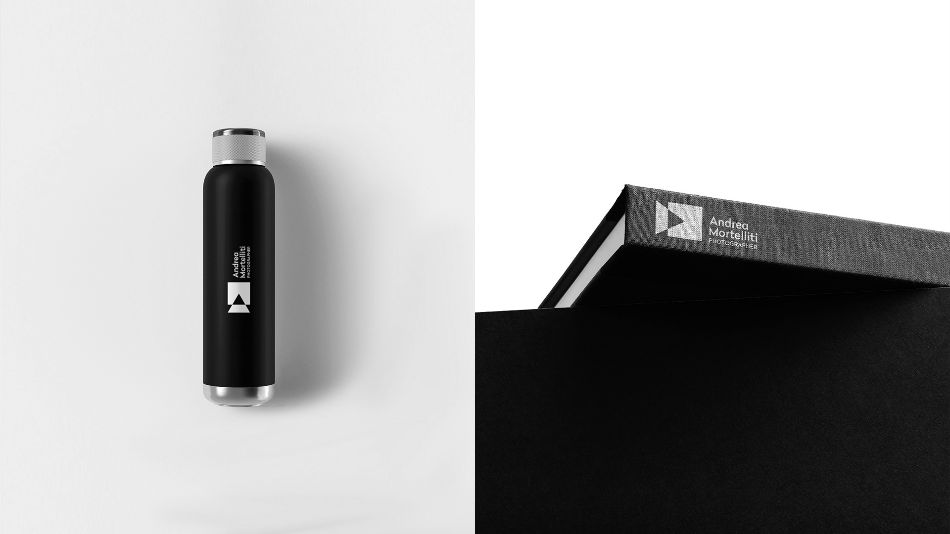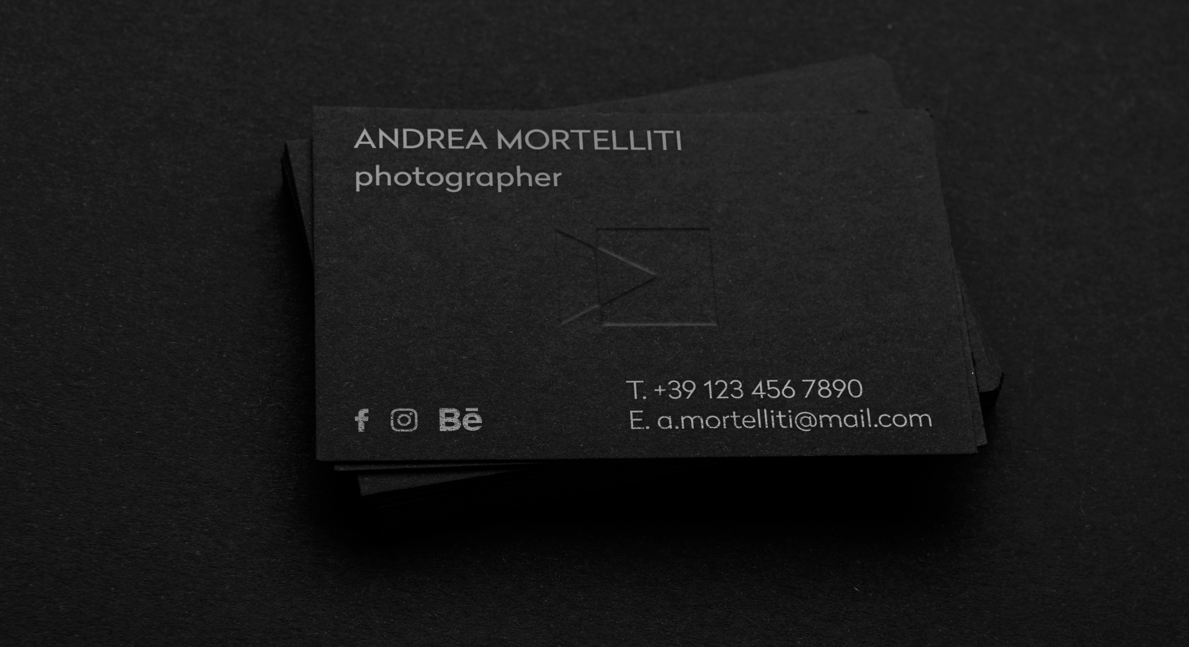

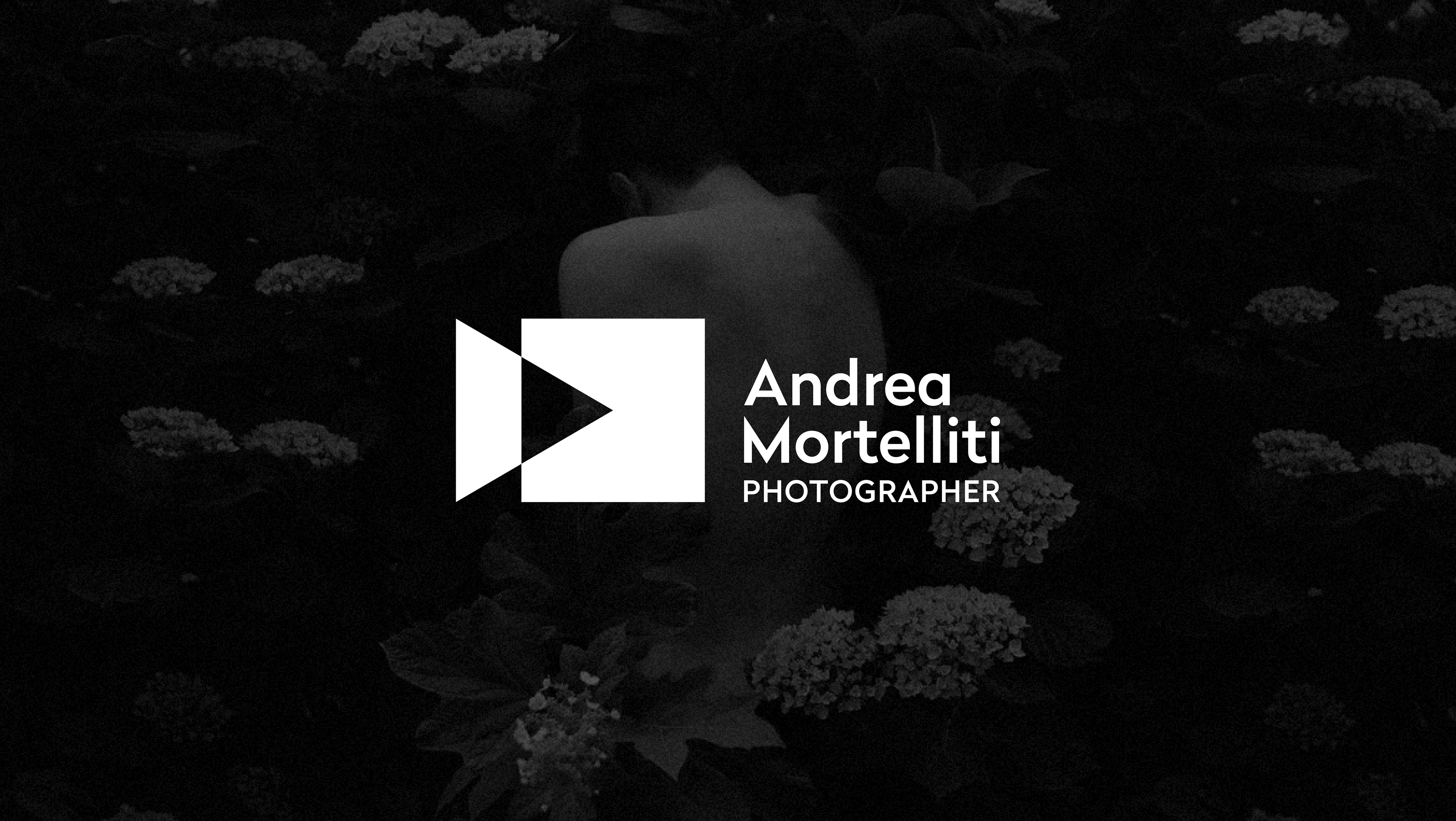
This project is based on a careful analysis and research of existing monograms, with the aim of designing an original branding to define the client's identity.
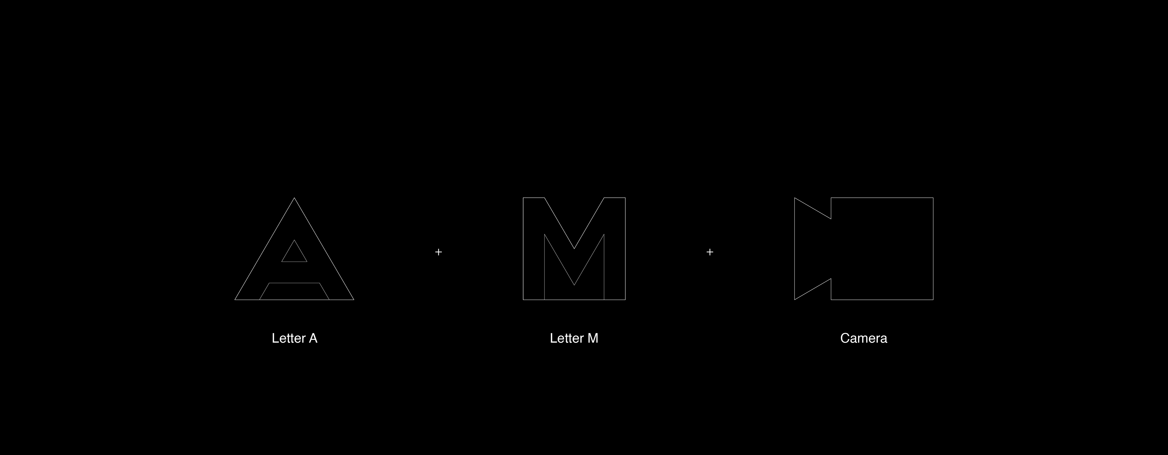
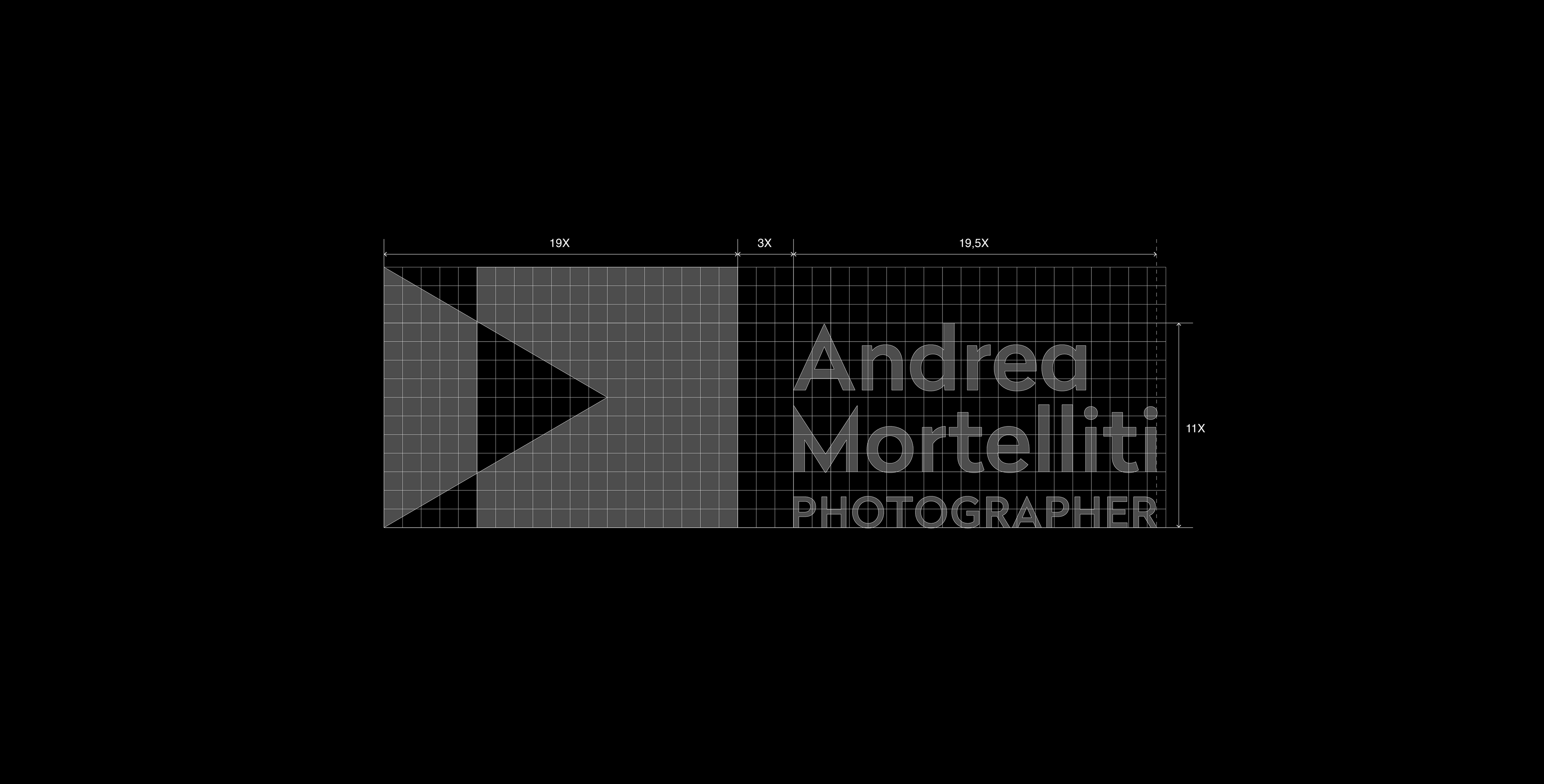
Starting from the letters A and M, a study was made on the primitive forms of the initials, obtaining an equilateral triangle and a square. These were subsequently intersected to create a graphic element attributable to the customer's activity.
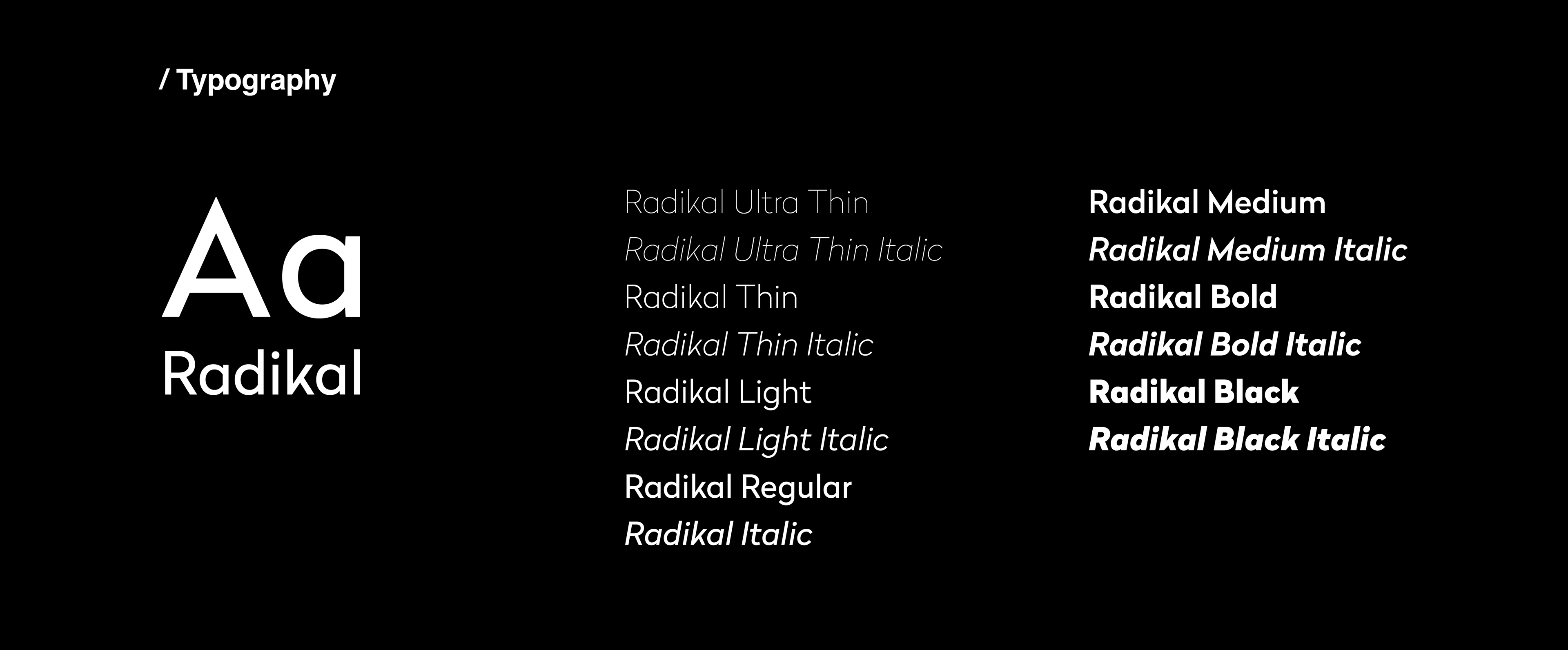
A geometric font was chosen for the logotype to recall the shapes of the brand's constituent elements.